
So you’ve got a notebook full of data, a pile of reports with numbers, and you’re verging on information overload. Time to break that data down for analysis. The right charts & graphs will help your PDCA group focus its efforts on the problem (or the contributors to the problem) that will have the strongest impact if solved.
Getting started
- Focus on those causes that offer the greatest potential for improvement
- Keep the Pareto Principle in mind: 20% of the contributors cause 80% of the problem
- Select the type of chart or graph that displays the relative importance of the contributors in a simple, quickly- interpreted, visual format
The Pie Chart:

The Simple Column Chart:

The Column Comparison Chart:

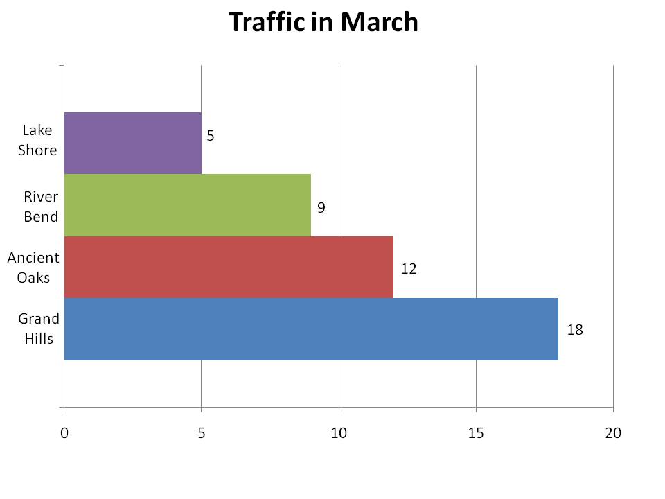
The Bar Graph:

The Stacked Columns Graph:
 The Multi-Source Stacked Column:

The Line Graph:

The Area Graph:

Generally, the largest bars indicate the biggest contributors to the overall problem. So, it makes sense to address these problem areas first. But, the most frequent or expensive is not always the most critical factor. Always ask: “What has the most impact on the goals of our PDCA?”
© April 2010 Homebuilding Partners, Inc. ![]()

[…] the original post: Which chart should you use for data collection? « Lean Homebuilding Post a […]
By: Which chart should you use for data collection? « Lean Homebuilding on April 28, 2010
at 8:11 pm
[…] This post was mentioned on Twitter by Todd Inman. Todd Inman said: Which chart should you use for data collection? « Lean Homebuilding: Lean Homebuilding. Identify & Eliminate Waste… http://bit.ly/9UZmqj […]
By: Tweets that mention Which chart should you use for data collection? « Lean Homebuilding -- Topsy.com on April 30, 2010
at 12:49 am
Hi JC,
Did you left out the Pareto chart intentional ? Guess the column chart is missing its distribution/accumulative %.
I’m just curious. Nothing serious 🙂
By: ganeshmuthiah on July 1, 2011
at 6:06 am
There are so many possible charts. Maybe that article needs a follow-up…. Thanks for reading!
By: JC Gatlin on July 1, 2011
at 8:09 am